Summer Change: A New Face to the Online Library
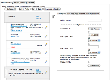
One of the very visible changes that is coming with the major, behind the scenes change in the architecture which powers the online courses is a new face for the Online Library.
The Online Library introduced in January 2009 was a big departure from the previous version of the Online Library. It allowed faculty and TAs to do a lot more with the organization of and information in the Online Library. It provided improved tracking tools and a whole lot more administrative options. Along the way, we added in the very cool Audio Notes feature, which allows faculty and TAs to record audio in the Online Library and automagically convert that audio in to an MP3 file.
There was a major problem, however.
When we implemented the revamped Online Library, we chose to develop the tool entirely in Flash. There were definite advantages to doing this. It allowed for things like drag-and-drop reordering of files and folders, and visual feedback while uploading files, and the ability to upload multiple files to the library at the same time. The problem was in our implementation choices. We were asking the Flash plug-in to do some things that it either wasn't very good at (allowing for drag-and-drop beyond the top and bottom edges of the Web page) or couldn't do at all (display libraries containing over 300 items in a single window). On top of that, the Flash-based Online Library had to a lot of repetitive data processing and on-the-fly rendering of information, which caused the library to load slowly and generally be slow to respond or behave inconsistently.
Although we made significant improvements in the performance of the Online Library application, we still hadn't gotten it to perform as we wanted, and some faculty found it increasingly frustrating to use. We knew that we had failed to provide a tool that was truly usable, and needed to make a change.
So we went back to the drawing board and decided to try a different implementation approach. The Online Library that will come with the new online course architecture this summer has been completely rewritten using standards-based HTML and JavaScript. While Flash still does make an appearance in the Online Library (it really is useful for some things), most of what you'll see is plain old standard Web page stuff. As a result, the library loads quite fast (even on libraries with 300+ items), acts more responsively, and has a vastly improved drag-and-drop engine.

The Online Library won't look all that different. There are no new features to tout. It will, however, load much faster and feel more responsive. And we think that's a pretty good thing.