What Will the Merged CoursePlus System Look Like
We've announced that the online course and CoursePlus systems are merging at the end of the 2013-2014 academic year. The major changes to the site were covered in a previous blog post, but one thing that was not included was how things will look in the merged system.
While the entire site is getting a visual refresh, most of the individual tools that faculty, TAs, and students currently use will look more or less the same. The site home page and individual course home pages, however, are going to look a bit different. The functionality of these pages is largely the same. They'll just have a shiny new user interface to make them look better on desktops, laptops, and mobile devices.
First, let's take a look at the new CoursePlus home page:
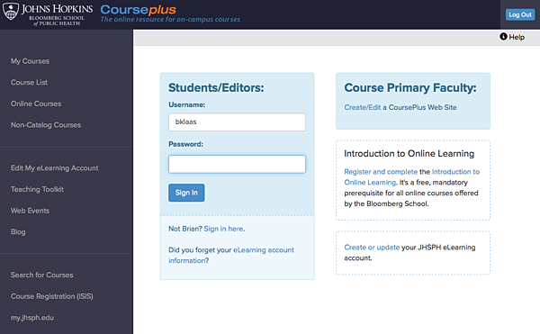
You can see that the overall look is cleaner and more open, with bigger fonts. Links to the various course lists are easier to find, and types of courses (from the catalog, online, non-catalog) are easier to find. We've also made it easy to get to other, related tools (course search, eLearning account management, ISIS) from the CoursePlus home page.
There will be future posts about how the course listing and post-login pages will look, but for now, let's move on to an individual course home page:
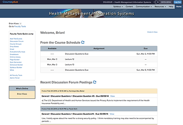
Again, there is a much more open look and feel to the page. While we've retained the same information architecture for course sites, we've replaced the tabs on the top-right of the page with simple text links and drop-down menus for each sub-section of the site. This means you can jump directly to the roster page in a site from the course home page.
For faculty, TAs, and site editors, there is also now a "Quick Jump" box which lists nearly all the tools available to you on the course home page. You no longer have to go from the site home page to another gateway page to get to the tool you want. You can jump in a single click from the course home page.
The display of the course term and academic year is also more prominent at the top of the page. Knowing which year's version of a course site you are working on is very important, especially to faculty who teach multiple courses in multiple terms each year.
Each course home page also lists upcoming events from the course schedule (or class sessions tool for on-campus courses), recent posts in the discussion forums, and recent items added to or updated in the Online Library. If students, faculty, TAs or staff involved in the course are currently visiting the course website, their names are listed in the "Who's Online" box on the left side of the page. All of this information makes the course home page a more dynamic place and gives everyone in the course a quick overview of what's going on in the course.
While each online course has a custom banner at the top of the course home page, on-campus courses will get a standardized banner which lists the course title, number, term and academic year in big, bold letters.
We hope you like the changes that we've made. We think they make the whole site easier to navigate and easier to look at. We'll be detailing additional changes to the look, feel, and functionality of the merged CoursePlus in the coming weeks, and in the meantime, we welcome your feedback!