Remaking the BBS: The New Topic View
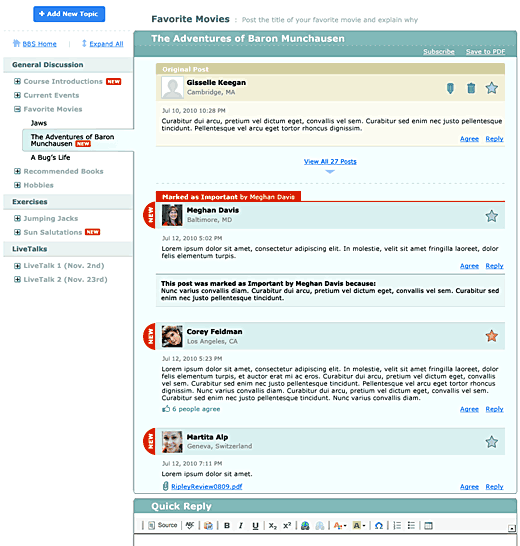
In this post in the "Remaking the BBS" series, we're going to look at the new heart of the BBS: the new topic view. The topic view contains all of the individual posts in a BBS topic, and captures the conversation between students, TA, and faculty. Here's what the new topic view is going to look like:

Some highlights:
- Messages that you have already read are hidden by default. This means that you don't have to scroll through page after page of posts to get to the newest messages in a topic. If you want to see all the posts in the topic, just click on the link near the top of the page that says "View All Posts."
- Click "Agree" to agree with a post. Similar to the Facebook "Like" button, you can "Agree" with posts rather than creating a whole separate message to do so. The names of all the people who agree with a post are listed when you move your mouse over the "[n] people agree" link. If you want to disagree with a post, you're going to need to reply to that post with one of your own.
- Bookmark posts by clicking the star. As explained in the post about the new bookmarks feature, you can quickly bookmark a post for later review by clicking the star icon next to a post.
- Faculty and TAs can mark a message as important. Being able to mark messages for later review is certainly useful to you as an individual, but if faculty or TAs want to mark a particular message as important for everyone in the class (maybe it's the answer to someone's question, for example), they can now do so. A message that's marked as important by the faculty or TAs can also have an explanation as to why that message was marked as important.
- Edit or delete your post whenever. In the current BBS, you only have 15 minutes from the time you create a post to edit or delete that post. In the new BBS, the default behavior is that you will be able to edit or delete your post whenever you want. However, faculty and TAs can still set up a topic or category to only allow you 15 minutes to edit or delete your post(s). This may be necessary for a BBS exercise, for example, so that you can't go back and edit your post once others have posted their work.
- Smaller nameplates. In the current BBS, the photo, name, and location of the person making the post can take up a lot of vertical space, especially if the post is short. We've made the "nameplate" area of each post much smaller, which means less scrolling and more focus on the content of each post.