The Schedule Builder Gets an Upgrade
The Schedule Builder tool is a core part of CoursePlus. It's the gateway to all content in all online courses and about half of the on-campus courses that use CoursePlus. It's responsible for generating the main Content page in a CoursePlus site as well as the schedule page in the syllabus section of courses which opt to use the tool.
The Schedule Builder tool is also one of the older tools in CoursePlus, with a complex interface and a codebase that reflects a time before standardized interface frameworks. The tool uses cascading permissions to determine who gets to edit what, which can be difficult to get right when new features are requested. The interface itself is a bit slow to respond when adding or editing individual events, which is a legacy of the age of the code.
The CoursePlus team rebuilt the Schedule Builder tool with the following goals in mind:
- A fast, responsive interface
- Faster editing of existing events in the schedule without overlays
- Streamlined display of information, focusing on dates
- Simplified and improved drag and drop of items in the schedule
- Improved automatic lecture renumbering
- Improved, chronological change log
Additionally, the CoursePlus team added a major feature that was requested multiple times over the years: Hidden Categories. You can now hide entire categories of events in the Schedule Builder, rather than just indvidual events. This allows you to build out your schedule in Schedule Builder without students seeing it as it develops. You can revise entire segments of your course, and by putting the links to those revised events and items into a hidden category, hide that work until you’re ready for students to see it.
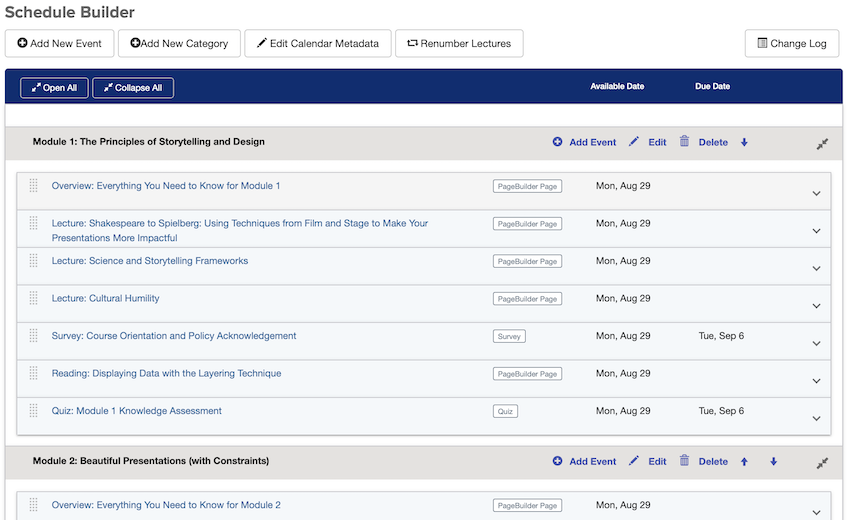
Here’s what the new Schedule Builder tool looks like:

Each category or event in the new Schedule Builder tool takes up significantly less vertical space than the old version of the tool. This makes it easier to move through a long schedule, and improves drag and drop targeting. Although each event takes up less vertical space, you now also see the kind of item that each event links to from this overview. That is to say, you can see that an event links to a quiz, Page Builder page, LiveTalk, Drop Box, survey, and more.
You may notice that there are no “Edit” and “Delete” links next to each event in the schedule. To edit an event, you simply click on the bar for that event in Schedule Builder. To delete an event, you click on the bar for that event and then click the “Delete” button. By shifting “Edit” and “Delete” actions to other methods, we reduced overall visual repetition and noise, put greater emphasis on dates (it is a schedule, after all), and freed up screen space.
To drag and drop events in the schedule to new locations, you click the textured gray dots on the left side of any event. This behavior aligns with how drag and drop works in other tools, like the Gradebook and Online Library.
The new interface also gives you feedback if you made changes without saving them. This makes it less likely that you’ll forget to save your work in this more dynamic, fluid schedule editing environment.
We hope that you find the new Schedule Builder tool to be a big improvement over the old one. If you have questions about this new version of the Schedule Builder tool, CTL Help is happy to answer your questions.
Below is a brief video of what’s changed in the Schedule Builder interface: