The New Online Library: A New, More Intuitive Interface
The Online Library is receiving an overhaul. If you haven't read the previous entries in this series about why these changes are being made and what's new in this new version, please do so.
The Online Library interface has long been predicated on a “folders and files” metaphor. Just as you manipulate files and folders on you desktop or laptop computer, so too can you organize items in the Online Library into files and folders. This is a natural way of working with items of multiple types that need logical groupings.
The current Online Library interface, built more than a decade ago, attempted to make as much useful information as possible immediately visible. This included the tools to add items to the library. If you just wanted to review or organize files in the library, the tools to add files, weblinks, or folders would always be on display, taking up valuable screen space. The net effect of this design was that items in the library would always take up more vertical space than any other controls in the interface. For libraries with under twenty items, this was manageable. For large libraries, sometimes with hundreds of items in the library, this led to unnecessary scrolling and wasted visual space inside the web browser. The extra vertical space also made dragging and dropping files difficult — especially if the “drop” target location was outside of the content displayed in the current browser window. The vertical space consumed by individual items in the library would also grow with additional metadata added to the item, such as open/close dates, descriptions, or links to Page Builder pages or class sessions. Individual user screen size often exacerbated all of this vertical scrolling, as you can see a lot less on a 13” laptop monitor than a 27” desktop monitor.
The new Online Library works to address all of these issues.

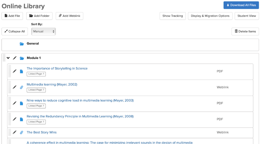
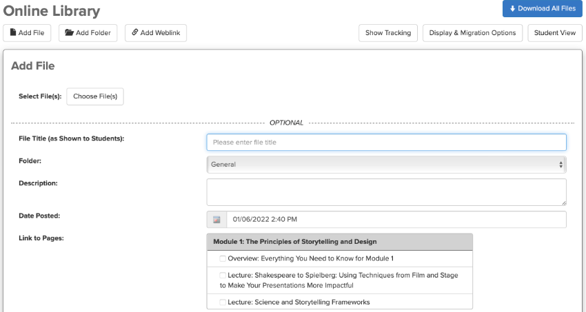
The interface of the revamped Online Library moves the tools to add files, weblinks, or folders into pop-out forms accessible by buttons at the top of the screen. They only appear when you need them.

This frees up literally half of the on-screen space, allowing individual items in the library to stretch horizontally, rather than vertically. By condensing additional on-screen display for every item in the library, more items can be displayed at once on any screen of any size. This, in turn, makes dragging and dropping items within or between folders much easier. Drag and drop targets are bigger and function much more like they do on your desktop or laptop file system. Scrolling is also reduced, making it easier to quickly browse the library and ensure proper overall organization.
The new Online Library interface also looks much more like a desktop or laptop folder and file system, with a cohesive set of icons delineating each item type and an indented visual hierarchy that feels like the one you’d find on your desktop or laptop computer. The visual style of the library matches that of tools like Google Drive, with a modern, clean style that emphasizes important information while de-emphasizing — but not hiding — contextual details.
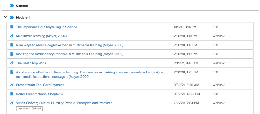
The student view of the Online Library shares this same, modern style that takes up less vertical space per item:

There are other niceties to the Online Library interface. You can now access the student view of the Online Library directly from the main faculty view. Page Builder pages that you can link an item to now appear in the exact same order as they appear on the main course content page — calendar groups included!

You’ll also notice that this new interface isn’t a radical departure from the current Online Library interface. This reduces any learning curve and makes it easy for anyone to jump right in to the new Online Library.
As we discuss all of the new features of the Online Library, please reach out to the CTL Help team if you have any questions!