A Beginner's Guide to Authoring Universally Accessible Materials, Part 2: Structure and Formatting
This guest post is by Celine Greene, Senior Instructional Technologist in the Center for Teaching and Learning.
This is the second in a series highlighting some simple skills that, when turned into good habits, can go a long way toward creating and editing accessible materials. The series touches on document properties, structure and formatting, alternative text, hyperlinks, color contrast, fonts, and a bit more. Don't worry – while some of those topics may not be in your wheelhouse right now, these guidelines are written for the "non techie". I promise to tread lightly!
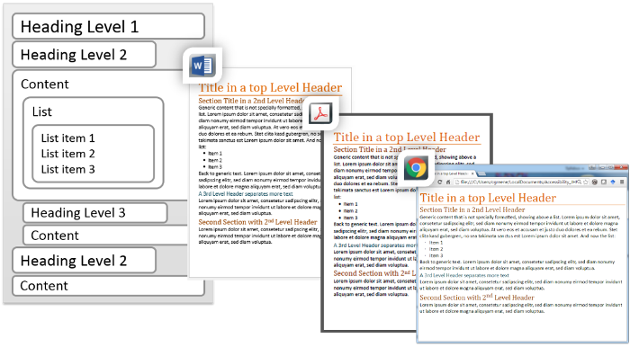
Let’s continue by discussing document structure and formatting. What is document structure and formatting, and why should you care? Consider how difficult it would be to read a book that was written in only plain text with no title page, chapters, page numbers, nor even paragraph breaks. This level of effort and inevitable confusion is avoided by properly formatting a document to give it STRUCTURE. This characteristic refers to the “scaffolding” of a document. The structure ensures the parts of the document are organized both in how the document appears (its layout) and how it is navigated (including its reading order). The structure is determined by “levels” (heading one, heading two, etc.) and other “containers” (lists, paragraphs, etc.). Formatting a document goes one step further in defining the appearance by assigning fonts, paragraph spacing, alignment, bullet types, headers and footers, etc. When formatting is built directly into the document structure, together the attributes make a Style. And a document with Style is a document with elegant design!

Proper structure makes certain that what is laid out visually in the original editor is maintained when a document is opened by or translated to another program or technology. It also makes sure that a person or technology accessing a document is able to easily move between sections. For example, a Word document that is properly structured can easily be translated and opened Adobe Acrobat or even a web browser. And this same well-structured document allows a person relying on a screen reader assistive technology (AT) to know where a bulleted list of items ends and a new, separate paragraph begins. Certain AT will even allow users to avoid having entire sections of a document read to them by allowing them to skip from the beginning to the end of a section, much like others who can see the document might do with a “visual scan”.
It’s important to note that our job here is not to worry about any assistive technologies that might be used; rather we just need to embrace best practices when we edit our documents!
So how do we control the structure and formatting – or style – of a document? The best practice for everyone is to simply use the user-friendly tools built into common editing programs.
To properly format a document and build its structure, always use a program’s built-in tools instead of trying to laboriously format elements from scratch. For example, use placeholders from layouts in a PowerPoint Slide Master (using an accessible template, such as those provided by CTL). And use Styles (based on a document’s theme or customized) when you insert descriptive Headings emphasizing separate sections of a Word document. Use the shortcuts for Bullets and Numbered lists, increased/decreased indents, columns, etc. in ALL editors - even CoursePlus’s Rich Text Editors. Do not use empty lines to space paragraphs or other blocks of text; instead use Line Spacing Options (e.g., “Add Space Before Paragraph”). And use the shortcuts to insert true Headers and Footers. Never try to make something just look like any of these elements; using the built-in tools are the only way to guarantee the integrity of a document’s structure and format, or style.
- Learn about Headings and how to use them correctly (written about web pages, but applicable to all documents)
- Learn about Slide Layouts and Placeholders in Microsoft PowerPoint
- Learn to add Heading Styles, Lists, and Headers and Footers in Microsoft Word
A closely related concept to the document structure is its reading order. This is the order that a document would be “read” (or translated) by any technologies, including screen readers. By default, the reading order for most Word documents is top to bottom, left to right, and is further controlled by its headings. If you are creating a form in Word, you will need to verify its tab order. If you are working in Microsoft PowerPoint, you should start with accessible templates whose placeholders in the slide layouts are already in a correct reading order, but you should also always verify the reading order after editing any slide.
- Learn to set and verify the reading order in Microsoft PowerPoint
And with that, it’s time to start putting these techniques in action! Once you understand how beneficial controlling document structure, formatting, and reading order is from the outset, you should be eager to make these part of your routine. Not only will you be embracing a best practice toward making universally accessible resources, you’ll actually be efficient in your efforts. Plus your documents are going to be elegant, professional designs that will reach more people while standing the tests of time and constantly updated technologies!
Return to Part 1 in this series to learn about document properties, or proceed to learn about alt text in Part 3.