A Beginner's Guide to Authoring Universally Accessible Materials, Part 3: Alt Text
This guest post is by Celine Greene, Senior Instructional Technologist in the Center for Teaching and Learning.
In reading this series of posts on Authoring Universally Accessible Materials, I hope you’ve started to understand both the importance and the potential impact of accessible materials – resources that can be obtained and understood without revisions and adaptations by the greatest number of people and technologies.
The simple steps that have already been outlined (adding document properties, using built-in tools for structure and formatting, and paying attention to reading order) should start to become habit and part of your positive routine. Today, I am asking you to embrace one more practice: including alternative text for any non-decorative image, non-text media, or other complex element that is part of a document or website.
So what is alternative text, more commonly referred to as “alt text”, and why is it important?
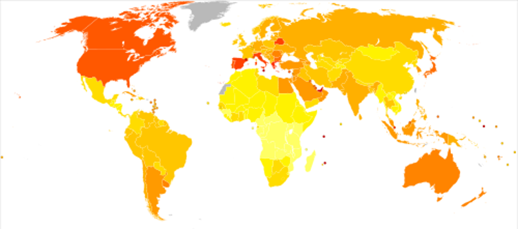
Alt text is a concise statement that serves as an alternative, text-based representation of an object in a digital document, presentation, or website. Alt text is “visually hidden”, but travels with its assigned object as part of the code or file’s data, much like the document properties. People opening a resource may not see the alt text at first glance, but if they want something summarized or if they rely on an assistive technology to present information, they may depend on the alt text. For instance, in a PDF or website that contains a heatmap depicting worldwide diabetes prevalence, such as the image below, a person who doesn’t understand heatmaps might move their cursor over the image and, depending on their software, have the alt text appear in a pop-up overlaying the image so they can grasp what is being depicted.
And what about the person who might not be able discern the map’s colors, or perhaps not see the image at all – due to a visual impairment or a web browser not displaying the picture for some reason? That person may rely on a text-only version of the resource or on an assistive technology (AT), such as a screen reader, to translate the visual representation to its alternative text.
Another use of alt text is summarizing a complex object other than an image, such as a table that organizes detailed or large amounts of data. Beyond providing clarity, the alt text on these objects may save someone from exerting extra effort by interacting with an object when they might not really want nor need to. One example when alt text may help is if a person dependent on a screen reader’s narration has a summary of an intricate bar chart read to them before deciding whether to listen to the entire set of linked data. Another example might be a person dependent on alternate navigation (e.g. single switch) coming across the alt text for an embedded video; the text summary will help them decide whether or not playing the video is worth expending their energy.
Now that you have an idea of what alt text is and why it’s important, how do you go about including it in your universally accessible materials? And is there guidance on writing appropriate alt text?*
Any time you include an image, graph, chart, complex table or other non-text object that isn’t purely decorative, take a moment to format the object and enter the alt text. For all these objects, you can include the short description in a field labeled “Alt Text” in the newer versions of the Microsoft (MS) products. In MS Office 365, some people access this field by right-clicking the object and selecting “Edit Alt Text” from the contextual short-cut menu. In software beyond MS Office, such as Adobe Acrobat, the method to include alt text is going to be slightly different for each. Even CoursePlus prompts you for alt text when you insert an image in any of its rich text editors.
- Learn to add Alt Text to images and other objects in Microsoft Office
- Learn to add alternative text in Adobe Acrobat
Appropriate alt text is a brief statement or phrase that describes the non-decorative object to someone who cannot see nor otherwise discern the object. The alternative text should:
- Remain concise. Many screen readers cut off alt text at about 125 to 160 characters. If your description is longer than that, consider an abbreviated statement in the alt text field and then writing a fuller description as “true” (visible) text near the object; or including a footnote or citation (especially one with a digital object identifier (DOI)) that translate the information more completely.
- Avoid stating the obvious. If the alt text is attached to an image, there is no need to relay that information unless the type of image is important – for instance: MRI, etching, or even screen clipping. Also, if providing alt text for a data visualization, state the type – e.g. histogram, pie chart, or line chart.
- Describe the most important information about the object in relation to its context – i.e., its proximity in a document or website. For example, “annotation of previous image highlighting…”
- Repeat or summarize any text that is part of an image. It’s best to avoid having text as part of an image. But if you can’t do that, make certain to include its most important words in the alt text statement or elsewhere on the document or website.
- Use language that is appropriate for the intended audience. For example, alt text describing a diagram in a scientific journal may be very different than the same diagram’s alt text on a company’s public website.
Writing alt text that is both informative and concise will take practice. There is no absolute, correct way to accomplish this! Furthermore, the best alt text is almost always going to be written by the resource’s original author. Only that person can translate with certainty what their intended audience should discern from an object.
If you want to learn more about alt text, check out DIAGRAM Center’s Image Description Guidelines. And remember: Alt text should be brief, informative without stating the obvious, and appropriate for the intended audience.
Return to Part 2 in this series to learn about accessible structure and formatting, or proceed to learn about color and contrast ratios in Part 4.