Remaking the BBS: A New Start Page
I want to begin this series of posts about the new BBS coming to online courses and CoursePlus with a look at the new start page for the BBS. If you want to know more about the design and feedback process that we went through in designing this new version of the BBS, you can read the original post in this series.
This is the new start page for the BBS:
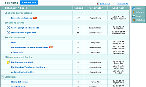
One of the first things you'll hopefully notice is that, in the new BBS, all of the topics in all of the categories are listed on this new BBS start page. One of our goals for the redesign was to make it easier for you to get to messages of interest to you faster than before, and to make navigating between categories, topics, and messages faster. By making the start page of the BBS list all the categories and all the topics in those categories, you get an overview of all of the activity in the BBS in one place. You don't have to drill down into each category to get an overview of the activity in that category.
But what if the course BBS has a lot of categories and a lot of topics in each of those categories? Wouldn't this page get really long and require a lot of scrolling? If a course BBS has more than six (6) categories, the new BBS start page will instead collapse the list of topics in each category so that you aren't overwhelmed with a page that scrolls and scrolls and scrolls while it lists all the topics in all the categories. You can open up any category to see all the topics in that category by clicking the + / - icon next to the category title. You can also open the listing of all categories, or collapse the listing all categories, by clicking the "Expand / Collapse All" link at the top of the page.
Better yet, if you open the listing of one category or close the listing of another category, the BBS will remember this and keep the same display of categories and the topics the next time you visit the BBS or come back to the BBS start page.
The new BBS start page gives you clear visual indicators of the activity within topics in the BBS. Topics with new messages since your last visit have a "NEW" icon next to them. This is a lot clearer than the yellow/blue folders in the current BBS. Topics that are set as read-only by the faculty or TAs have a "no write" icon next to them. Sticky topics (topics that always display first in the listing of topics within a category) have an icon as well. Private categories — that is, categories to which only certain people have access — are indicated by a lock icon next to the title of the category. This gives a nice, clean indicator of which categories are open to everyone and which are for select groups of people only.
So that's a quick look at the new BBS start page. There's a lot more to discuss (like that little box on the right side of the screen), but those are all topics for future posts in this series. In the meantime, if you have any questions or comments about the new BBS start page, feel free to post!