A Makeover for the Discussion Forum
Students, faculty, TAs, and staff come together on the course discussion forum. It can be a place of rich conversation, idea sharing, and debate. The Discussion Forum is critical to building community in online courses and can be an important backchannel in traditional, face-to-face courses.
The current version of the Discussion Forum in CoursePlus has a lot of features. Some of those features are so well hidden that they’re hardly ever used. The Discussion Forum also reflects both design choices made when the current version was launched over a decade ago, and creeping, small inconsistencies that have been introduced in the years since then. The CoursePlus team worked hard over the past few months to refresh the Discussion Forum interface, fixing some of the inconsistencies and putting a modern patina on the interface.
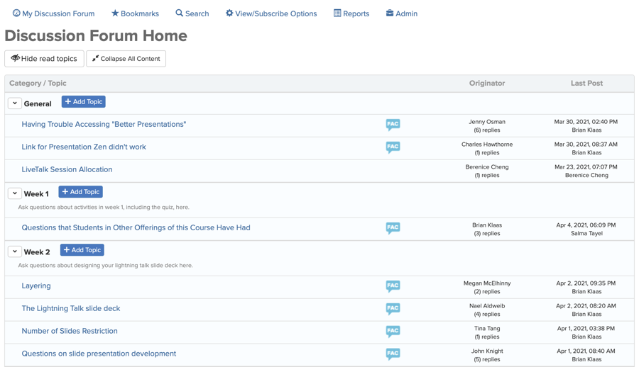
A picture is worth a thousand words, so it’s simplest to show you the before and after of this refresh. Here’s the main Discussion Forum page before the refresh:
Here’s the main Discussion Forum page after the refresh:
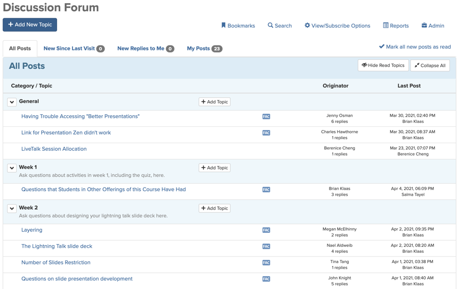
You’ll hopefully notice stronger lines and cleaner icons throughout the new page. Tools and columns of information have been evenly and consistently placed. There’s less unused white space at the top of the page, which means less scrolling down to see what’s important.
The biggest change of to this page is the elimination of the “My Discussion Forum” page as a separate page. The tools found on that page — “New Since Last Visit,” “New Replies to Me,” and “My Posts” — are now just a click away on the main Discussion Forum page.
The CoursePlus team also did work on the backend to rewrite some of the database queries for this page to make it faster to load, particularly on large Discussion Forums with hundreds (or thousands) of posts.
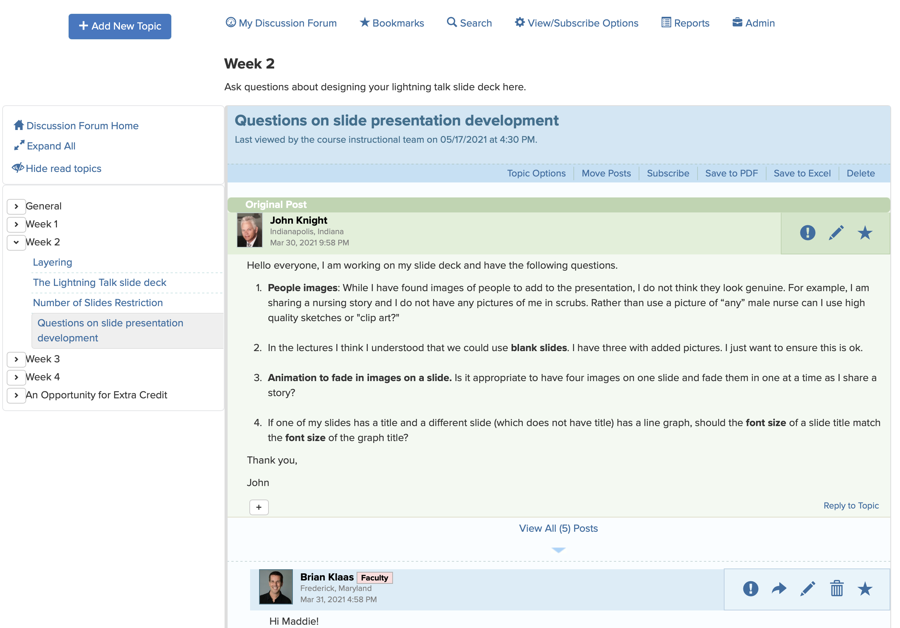
The individual topic view in the Discussion Forum used to look like this:
The topic view now looks like this:
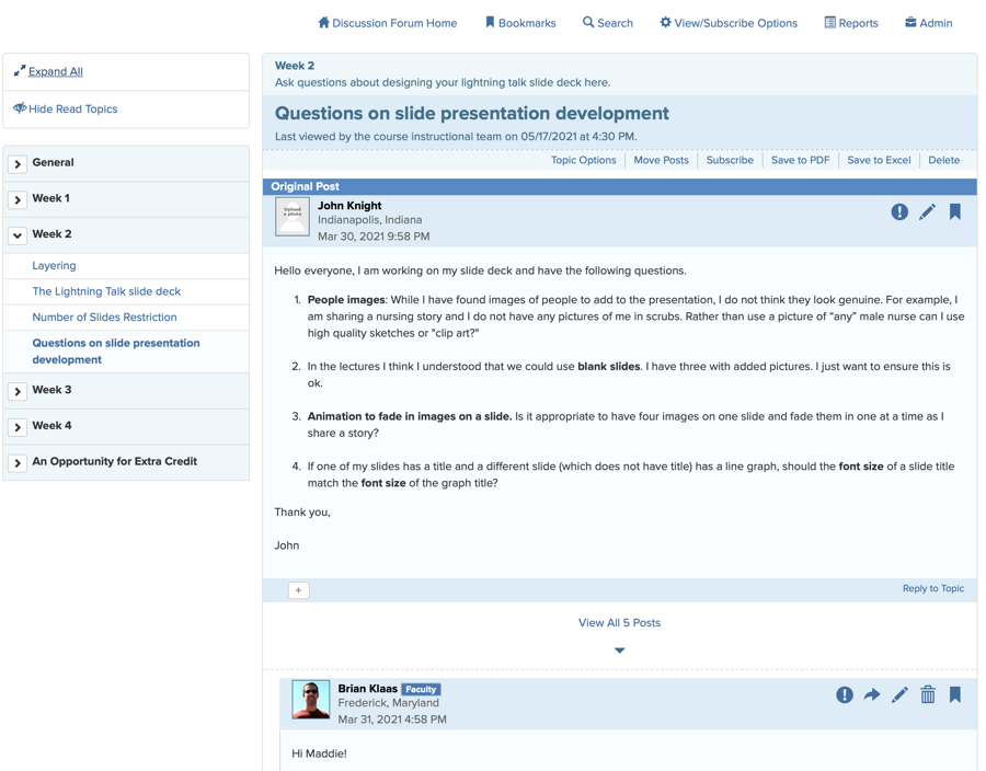
The left navigation bar on the topic view now has a more compact view with highlighting to indicate the current topic in the larger list of categories and topics. Space between posts is more consistent, and replies to replies have clearer visual delineation. As with the main Discussion Forum page, icons have been refreshed to be high-resolution on any screen size.
The CoursePlus team also fixed a few long-standing (and very well hidden) bugs during this refresh. All of the efforts result in a leaner, cleaner user interface and code base.
As always, if you have any questions about these changes, please contact CTL Help!