The Course Groups Interface Gets a Refresh
CoursePlus has been around, in one form or another, for over two decades. Some modules within CoursePlus have received many updates over the years, while others have not. Even though the CourePlus team works hard to make things as simple as possible, visual inconsistencies creep in over twenty years.
The Course Groups tool is one of the older tools in CoursePlus, and hasn’t received functional or interface updates in a long time. It turned out to be a great candidate for the first step in a long process: overhauling the CoursePlus interface for greater visual consistency and modernizing the underlying code that powers the interface in your web browser.
There were two main goals for this visual refresh.
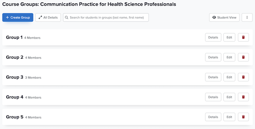
First and foremost, the CoursePlus team wanted to streamline the Course Groups interface with the goal of making it easier to see group membership and manage group membership. To that end, a number of extraneous buttons were removed and some functionality was combined into menus. Additionally, editing group membership now allows you to drag and drop individual or groups of students in and out of groups. Subtle animations make it clear when you’ve successfully updated group membership and even group details.
The overall style is cleaner, more open, and has a clearer visual hierarchy of text and form elements, as can be seen in the screenshot below.

Second, this new Course Groups interface is the first implementation of a new design system for CoursePlus. A design system for web applications is like a style guide that ensures all the buttons, fonts, and layouts look and feel the same across the site, making it easy to use. It’s similar to how your favorite apps have a consistent look, making it simple to navigate and understand. Implementing a new design system takes a lot of work, but the long-term payoff is a highly consistent, functional interface across a complex web application like CoursePlus. The design system for CoursePlus will help ensure that, over time, all CoursePlus tools will look and act in a similar way.
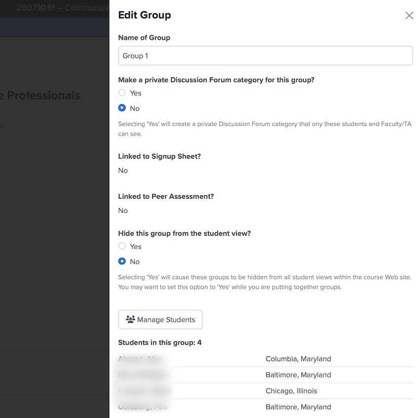
This design system is still evolving, and your feedback will help make it even better! One new feature of the design system is opening short forms in a slide-out drawer instead of a new page, as you can see below:

In rebuilding the Course Groups interface, the team decided to add two new features:
-
If a group is linked to either an active peer assessment or signup sheet, deleting that group is blocked from within the Course Groups tool. A group linked to a peer assessment cannot be edited or deleted from an hour before the linked peer assessment is scheduled to open to students until the end date and time of the peer assessment. This prevents problems with altering group membership once a peer assessment has opened. Similarly, if a group is created via Signup Sheets, the group must be deleted from the Signup Sheets module. This prevents accidental orphaning of groups tied to signup sheets.
-
A simple search tool was added to the main groups administration page. You can type a student name in the box and the listing of groups is filtered to only display groups where that student is a member. Additionally, the group details automatically open if they are closed.
Otherwise, the refreshed Course Groups tool is functionally equivalent to the previous version of the tool.
As always, if you have questions about these changes, or feedback on the look and feel of this new design system, please reach out to the CTL Help team, and we will be happy to answer any questions you might have.